Packed bubble charts let you display data in a cluster of circles. You use dimensions to define the individual bubbles, and measures to define the size and/or color of the individual circles. Packed bubble charts are a relatively simple data visualization that can provide insight in a visually attractive format.
In Tableau, you create a packed bubble chart by first placing one or more dimensions on the Columns shelf and one or two measures on the Rows shelf. Then choose packed bubbles from Show Me.
The following exercise walks your through creating a basic packed bubble chart that shows sales and profit information for different product categories.
-
Connect to the Sample - Superstore - English (Extract) data source, which is included with Tableau Desktop.
-
Drag the Department dimension to Columns.
A horizontal axis is created showing product categories.
-
Drag the Sales measure to Rows.
The measure is automatically aggregated as a sum and a vertical axis is created.
Tableau displays a bar chart—the default chart type when there is a dimension on the Columns shelf and a measure on the Rows shelf.
-
Choose the packed bubbles chart type from Show Me:
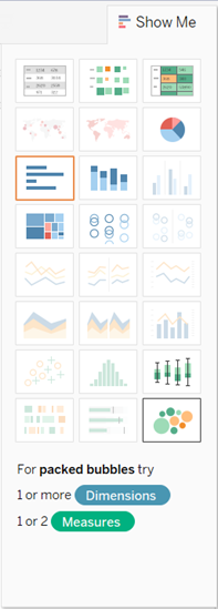
Tableau displays the following packed bubble chart:

-
Drag Region to Detail
on the Marks card to get more bubbles in the view. There isn't enough
space on this page to make the image big enough to show labels for all
the circles. With a bigger image, more labels would display, but it's
often the case that some bubbles will be too small even when the view is
fairly large. When this happens, hover over a bubble to see the
tooltip.

At this point you can continue adding dimensions to the view to multiply the number of circles—packed bubble charts that show hundreds of bubbles can be interesting for some purposes. Or you can drag a second measure to color, to add another layer of information to the view.
-
Drag Profit to Color on the Marks card:

-
Drag Region to Label on the Marks card so that users won't be confused by seeing identical labels on different circles:

The size of the bubbles shows the sales for different combinations of region and department; color shows profit (the darker the green, the greater the profit).