Bar charts are a great way to compare data across categories. In Tableau, you typically create a bar chart by placing a dimension as the innermost field on the Rows shelf, and a measure as the innermost field on the Columns shelf, or vice-versa. The innermost field is the one farthest to the right.
A bar chart uses the bar mark type. Tableau automatically selects this mark type when the data view matches one of the two field arrangements shown below, provided the Mark type is set to Automatic. You can add additional fields on these shelves, and Tableau will not change the chart type, provided a dimension and a measure remain innermost.
| Creates Vertical Bars | Creates Horizontal Bars |

|

|
To create a bar chart that displays total sales over a four-year period, follow these steps:
-
Connect to the Sample - Superstore - English (Extract) data source, which is included with Tableau Desktop.
-
Drag the Order Date dimension
to Columns.
The data is automatically aggregated by year and column headers are displayed.
-
Drag the Sales measure to Rows.
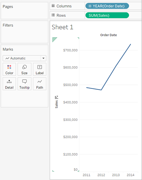
The measure is automatically aggregated as a sum and an axis is created. The column headers are relocated to the bottom of the view.
Tableau automatically selects Line as the mark type because of the date dimension.
-
On the Marks card, from drop-down list of view types, select Bar.
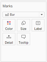
This changes the view to a bar chart (also known as a histogram).
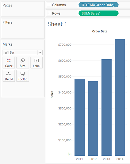
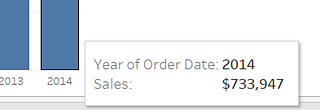
The marks (bars) are vertical because the axis is vertical. The length of each mark represents the sum of the sales for that year. For example, the sum of the sales in 2013 is $10,319,053, which you can verify by hovering the mouse cursor over that column:
-
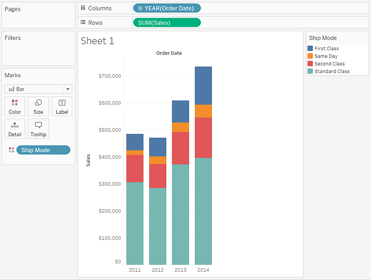
Drag the Ship Mode dimension to Color on the Marks card.
The view shows how different shipping modes have contributed to total sales over time. The rations seem consistent from year to year:
-
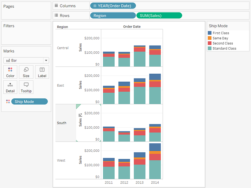
Drag the Region dimension to Rows, and drop it to the left of Sales to produce multiple axes for sales by region.
Notice that sales for the International region exceed sales for other regions so much that sales for other regions appear too compressed to be readable:
-
To better assess how sales vary by ship mode
in the US, you can filter out the International region, either
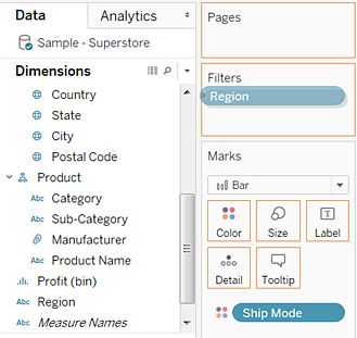
temporarily or permanently. To do this, drag the Region dimension again, this time from the Data window, to the Filters shelf.
-
This opens the Filter [Region] dialog box. Clear the International check box and then click OK:

Your final view should look like this:
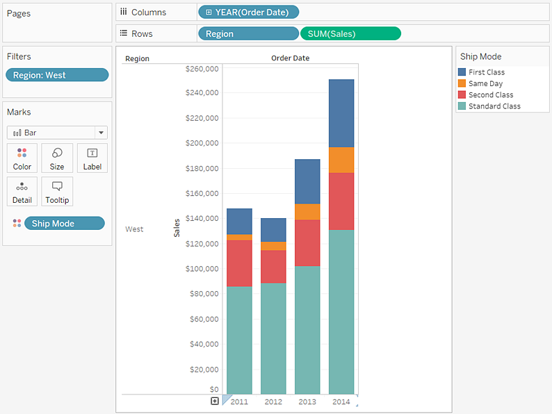
This view gives you enough information to answer some questions about your data—for example, which regions have shown consistent growth in sales over the four-year period. But answers only lead to more questions, and you can go on developing the view for as long as you like.
Thank you for sharing this information about building bar charts in Tableau online training
ReplyDeleteThank you for sharing wonderful information with us to get some idea about it.
ReplyDeletetableau online training