You can perfect pivot dates by placing different date levels
on different worksheet shelves simultaneously. Place the date field
on a variety of shelves and then select the desired date level from
the fields’ context menus.
For example, the following line chart displays years as column headers and then color-encodes the marks by quarter.

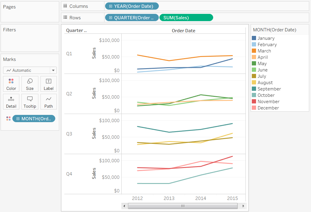
You can separate the marks by month and by quarter as shown below.

For example, the following line chart displays years as column headers and then color-encodes the marks by quarter.

You can separate the marks by month and by quarter as shown below.

This concept is a good way to enhance the knowledge.thanks for sharing. please keep it up core Java online training
ReplyDeleteThis comment has been removed by the author.
ReplyDeletenice post
ReplyDeleteEthical hacking training
Informatica data Quality Training
Informatica idq training
Thank you for sharing wonderful information with us to get some idea about it.
ReplyDeletetableau certification training