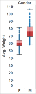
Box plots, also known as box-and-whisker plots, are a type of graph that shows the distribution of values along an axis. Boxes enclose the middle 50% of the data (that is, the middle two quartiles of the distribution). Lines, called whiskers, can be configured to display so as to include all points within 1.5 times the interquartile range (in other words, all points within 1.5 times the width of the adjoining box), or at the maximum extent of the data, as in the following image:

Boxplots are also available from the Show Me pane when you have at least one measure in the view:

For information on Show Me, see Show Me
To add a box plot:
-
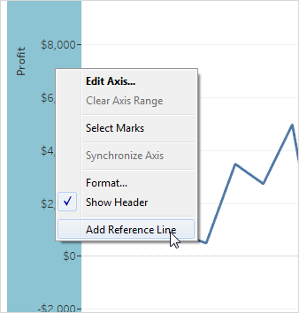
Right-click on a quantitative axis and select Add Reference
Line, Band, or Box.

-
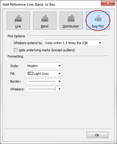
In the Add Reference Line, Band, or Box dialog box, select Box Plot.

-
Under Plot Options, specify placement for the whiskers:
-
Data within 1.5 times the IQR
- places whiskers at a location that is 1.5 times the interquartile
range—that is, 1.5 times further out than the width of the adjoining
box. This is also known as a schematic box plot.
-
Maximum extent of the data - places whiskers at the farthest data point (mark) in the distribution. This is also known as a skeletal box plot.
-
Data within 1.5 times the IQR
- places whiskers at a location that is 1.5 times the interquartile
range—that is, 1.5 times further out than the width of the adjoining
box. This is also known as a schematic box plot.
-
Specify whether to Hide underlying marks (except outliers)—that is, whether to hide all marks except those beyond the whiskers.
-
Configure the appearance of the plot by selecting a Style , Fill, Border, and Whiskers.
Show Me Vs. Add Reference Line, Band, or Box
The difference between adding a box plot using Show Me and adding a box plot using Add Reference Line, Band, or Box is that with Show Me, the box plot is your visualization, whereas with Add Reference Line, Band, or Box, you are adding a box plot to an existing visualization. For example, you could create the following view by first selecting a circle view in Show Me, and then adding a box plot from Add Reference Line, Band, or Box:
This comment has been removed by the author.
ReplyDeleteThis is a very well defined and informative blog. This will provide great help to people looking for Easter treats for classmates.
ReplyDelete