Box plots, also known as box-and-whisker plots, are a type of graph that shows the distribution of values along an axis. Boxes enclose the middle 50% of the data (that is, the middle two quartiles of the distribution). Lines, called whiskers, can be configured to display so as to include all points within 1.5 times the interquartile range (in other words, all points within 1.5 times the width of the adjoining box), or at the maximum extent of the data, as in the following image:
In Tableau, box plots are a chart type that you can select from Show Me, and also a type of reference line that you can add to an axis in a view. For more information about box plots, see Reference Lines, Bands, and Boxes. To add a box plot using Show Me and to configure that box plot, right-click the axis and then choose Edit Reference Line, Band, or Box.
The following exercise walks you through creating a set of box plots that show shipping costs on a per-customer basis, by continent and customer segment.
-
Connect to the Sample - Superstore - English (Extract) data source, which is included with Tableau Desktop.
-
Drag the Continent dimension to Columns.
The measure is automatically aggregated as a sum and row headers are displayed, identifying six continents.
-
Drag the Shipping Cost measure to Rows.
Tableau creates a vertical axis.
Tableau displays a bar chart—the default chart type when there is a dimension on the Columns shelf and a measure on the Rows shelf.
-
Drag the Customer Segment dimension to Columns, and drop it to the right of Continent.
Now you have a two-level hierarchy of dimensions from left to right in the view, with Customer Segment nested within Continent.
-
Choose the box-and-whisker plot chart type from Show Me:
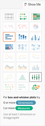
Tableau displays the following box plot:

Notice that there are only a few marks in each box plot. Also notice that Tableau has reassigned Continent from the Columns shelf to the Marks card. When you changed the chart type to a box plot, Tableau needed to determine what the individual marks in the plot should represent. It decided that the marks should represent continents. This was a reasonable conclusion, but it is not what we wanted.
-
Drag Continent from the Marks card back to Columns.
This is what the view now looks like:

Those horizontal lines are flattened box plots, which is what happens when box plots are based on a single mark.
Box plots are intended to show a distribution of data, and that can be difficult when data is aggregated, as in the current view.
-
To disaggregate data, select Analysis > Aggregate Measures.
This command is a toggle, and because data is aggregated by default in
Tableau, the first time you choose this command it has the effect of
disaggregating the data (that is, it removes the check mark from this
menu item). For information on disaggregating data, see Disaggregating Data.
Now, instead of having a single mark for each column in the view, you have a range of marks, one for each row (that is, each customer transaction) in your data source:

The view is now showing us the information we want to see. The remaining steps have to do with making the view more readable and more attractive.
-
Click the toolbar button for swapping axes:

The box plots now lay left-to-right, and we are able to see a lot more information in a more compressed space:

-
Right-click the bottom axis and choose Edit Reference Line, Band, or Box. The following dialog box opens:

-
In the Fill drop-down list, select an interesting color scheme. For more on these options, see Adding Box Plots.
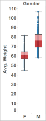
Now your view is complete:

This comment has been removed by the author.
ReplyDeleteI am happy for sharing on this blog its awesome blog I really impressed. thanks for sharing. Great efforts.
ReplyDeleteLooking for Big Data Hadoop Training Institute in Bangalore, India. Prwatech is the best one to offers computer training courses including IT software course in Bangalore, India.
Also it provides placement assistance service in Bangalore for IT. Best Data Science Certification Course in Bangalore.
Some training courses we offered are:
Big Data Training In Bangalore | Big Data Training In Bangalore
big data training institute in btm | big data training in btm layout
hadoop training in btm layout | best training institute for Hadoop in BTM Layout
python training institute in BTM layout | python training in btm
Data science training institute in btm layout | data science certification in bangalore
R Programming Training Institute in Bangalore
Apache spark training in bangalore | Spark Training In Bangalore
Best tableau training institutes in Bangalore
data science training institutes in bangalore
충주콜걸
ReplyDelete청주콜걸
원주콜걸
예산콜걸
원주콜걸
총판출장샵
총판출장샵