In Tableau there are pie charts, which are visualizations in which data is divided into wedge sectors in a round graph, illustrating numerical proportion, and there are pie marks, which are pie charts that you use as a mark type in a visualization, such as a map. For more information about pie marks, see Pie Mark.
Pie charts can be as effective as bar charts for showing proportions. Pie marks are very useful, for example, to demonstrate a percentage of marketing expenses by state.
The first exercise in this topic shows you how to create a view that used a pie chart.
Building a Pie Chart
This exercise walks you through creating a pie chart view that shows how different product categories contribute to total sales.-
Connect to the Sample - Superstore - English (Extract) data source, which is included with Tableau Desktop.
-
Drag the Sales measure to Columns.
The measure is automatically aggregated as a Sum.
-
Drag the Category dimension to Rows.
The default chart type is a bar chart:

-
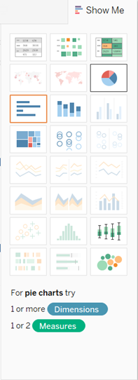
Choose the pie chart type from Show Me:
The result is a rather small pie:

-
To make the chart bigger, hold down Ctrl + Shift and press B several times. This is equivalent to selecting Format >Cell Size >Bigger.
-
Press and hold Ctrl as you drag the Category dimension from the Data window to Label on the Marks card.Labels are necessary because your pie chart only makes sense if your users can know what the individual slices represent.

-
Press Ctrl + Shift + B to make sure most of the individual labels are visible.
Building a Map with Pie Marks
This exercise walks you through creating a map view that shows sales totals for the US states (just the 48 contiguous states). The mark type is Pie, with the mark for each state showing the proportion of total sales for each ship mode (delivery truck, express air, regular air).-
Open the Sample - Superstore - English (Extract) data source, which is included with Tableau Desktop.
-
Double-click the State dimension.
Tableau adds State to Detail on the Marks card. Because Tableau has automatically assigned the State dimension a geographic role, it shows a map when you double-click it.
For the Sample - Superstore - English (Extract) data source, Tableau has also automatically created a hierarchy of geographic roles (mapping items), which includes Country/Region, State, City, and Postal Code:

Tableau will look for these kinds of geographical fields in any data source.
When you double-click State, Tableau automatically adds Country/Region and State to Detail. See Geographic Roles for information on how Tableau interprets geographical data in data sources.
-
To zoom the map in on the continental United States, drag Country/Region from the Data window to Filters. This opens a Filter dialog box:

-
Click None to clear all selections, scroll down and select United States of America, and then click OK.
The map rescales to show the continental United States:

(This is just a partial image—the full image is too large to show here.)
-
Drag the Sales measure to Size on the Marks card.
The marks in the view resize according to sales in each state.
-
From the Mark type drop-down list, selecting Pie:

There is no obvious change in the view, but the next step will not work as intended unless you have done this.
-
Drag the Ship Mode dimension to Color on the Marks card.
The view is now nearly finished—the only problem is that the marks (that is, the pie marks) are too small.
-
Click Size on the Marks card and drag the slider to the right about two-thirds of the way across:


Thanks for the help. What I would like to do is show a total for each pie chart on my map. I'm using a pie chart because I'm running a table calc which requires account name to be in the level of detail (otherwise I'd use a circle mark). When I try to show how many accounts are in each pie, I get a count per slice of the pie.
ReplyDeleteDo you have any tips for how I can show the per pie chart total? I've tried to create a secondary dummy measure and add the total there, but doing so removes the map from the background
This is an amazing collection of Tableau related knowledge
ReplyDeleteThank you for these!
Analytics
This comment has been removed by the author.
ReplyDeleteVery nice post
ReplyDeleteAdvanced Excel Training in chennai
Thanks for your blog . Very nice article and keep posting.
ReplyDeletetableau online training
best online tableau training
Thanks for sharing. It was really useful.
ReplyDeleteMachine Learning training in Pallikranai Chennai
Data science training in Pallikaranai
Python Training in Pallikaranai chennai
Bigdata training in Pallikaranai chennai
Great article, Super Dev Resources is one of my favourite websites. Thanks for the collection of the best blogs ever about Tableau Administrator Resumes Training Online . It's very helpful information, Keep blogging
ReplyDelete