Scatter plots provide an easy way to visualize relationships between numerical variables. In Tableau, you create a scatter plot by placing at least one measure on the Columns shelf and at least one measure on the Rows shelf. If these shelves contain both dimensions and measures, Tableau automatically places the measures as the innermost fields, which means that measures are always to the right of any dimensions you have also placed on these shelves. The word "innermost" in this case refers to the table structure.
| Creates Simple Scatter Plot | Creates Matrix of Scatter Plots |
|
|
The following exercise walks you through using scatter plots and trend lines to compare sales to profit:
- Open the Sample - Superstore - English (Extract) data source, which is included with Tableau Desktop.
-
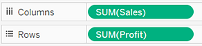
Drag the Profit measure to Columns.
The measure is automatically aggregated as a sum and a horizontal axis is created.
-
Drag the Sales measure to Rows.
The measure is automatically aggregated as a sum and a vertical axis is created.
Measures contain continuous numerical data. When you plot one number against another, you are comparing two numbers; the resulting chart is analogous to a Cartesian chart, with x and y coordinates.
What you have at this point is the most basic kind of scatter plot: a one-mark scatter plot:

-
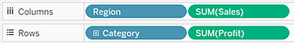
Drag the Department dimension to Color on the Marks card.
This separates the data into three marks—one for each dimension member—and encodes the marks using color.

-
Drag the Region dimension to Detail on the Marks card.
Now there are many more marks in the view. The number of marks is equal to the number of distinct country/regions in the data source multiplied by the number of departments. (If you're curious, see what would have happened if you'd dropped the Region dimension on Shape instead of Detail.)

-
Right-click in the view and choose Trend Lines >Show Trend Lines to add trend lines.
A trend line can provide a statistical definition of the relationship between two numerical values. To add trend lines to a view, both axes must contain a field that can be interpreted as a number—by definition, that is always the case with a scatter plot.
Tableau adds three linear trend lines—one for each color that you are using to distinguish the three departments:

-
Hover the cursor over the trend lines to see statistical information about the model that was used to create the line:
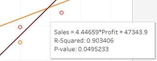
For more information, see Assessing Trend Line Significance. You can also customize the trend line to use a different model type or to include confidence bands. See Adding Trend Lines.
See Also
Example – Scatter Plots and Aggregation
ReplyDeletewell done! the blog is good and it is about Building Scatter Plots it is useful for students and tableau Developers for more updates on Tableau follow the link
tableau online course bangalore
For more info on other technologies go with below links
Python Online Training
ServiceNow Online Training
mulesoft Online Training
Nice Blog thank you for sharing Tableau Online Training
ReplyDelete"Which Forex pair and time frame is best to trade" is the frequently asked question and I want do give you the DEFINITE ANSWER.
ReplyDeleteAre you expecting that I am going to say something like EUR/USD on 5-minute time frame or GBP/USD on daily...? No, it is not so simple, but SIMPLE ENOUGH we can figure it out!
The "PROBLEM" is that markets change over time. If GBP/USD was a well trending currency pair a few years ago, today it is another one.
I actually want to let you know about a SPECIAL TOOL that I use to find the BEST TRENDING PAIRS among all the Forex pairs.
==> http://www.forextrendy.com?hfsdtb63546
The software scans 34 Forex pairs on all time frames from minute to monthly. This way you pick the best trending pair and time frame at the current time.
The system is running on our powerful computers, so you have nothing to download and install. Just join in and start using it within a FEW MINUTES! Get it on the link below:
==> http://www.forextrendy.com?hfsdtb63546”
This comment has been removed by the author.
ReplyDeleteIf you want to learn about how to make pie charts, bar charts and other different charts using tableau then click here to learn how.
ReplyDelete
ReplyDeleteThank you for sharing such a great information.Its really nice and informative.hope more posts from you. I also want to share some information recently i have gone through and i had find the one of the best mulesoft training videos
Easily, the article is actually the best topic on this registry related issue. I fit in with your conclusions and will eagerly look forward to your next updates.data scientist course in malaysia
ReplyDeleteData is incredibly messy, especially when it's not filtered or structured. Scatter plot examples this is why we use spreadsheets to collect and organize the raw data in rows and columns. While this organization is better than having data point clutter, it still falls short.
ReplyDeleteThank you for sharing wonderful information with us to get some idea about it.
ReplyDeletefull stack training
Choosing the right data visualization tool is very important for you to communicate your real-time information clearly. There are many complex visualizations like Scatter Plot, Sankey Diagram, Likert Chart & Pareto Chart but the Scatter Plot is the best to use when finding correlation between two variables.
ReplyDeleteRead more here:
https://blog.zumvu.com/scatter-plot-for-data-visualization/ .
Power BI Online Training
ReplyDeleteDevelop data visualization, reporting, and dashboard-building expertise using Power BI. Gain practical knowledge in transforming data into actionable insights.